The above picture shown depicts the first couple days of the London riots, each string represents a certain crime and the colour of the string corresponds to that specific crime. The length of the individual string is then decided by the total amount of crimes commited on that specific day. By doing this we create multiple charts that show the rise and fall of the riots along with which crimes were most common all without the need of numbers
This image is a continuation of the previous one showing the following next two days of the riot. As we can see the scale of the individual charts have greatly increased and become much more clear and visable.
Overall just from the first few days of the London riots we can see from this picture just how much crimes increased by looking at the charts and how fast it all happened. This image only shows the first four days of the riots although it lasted roughly a couple of weeks
Data Mapping
Home Page
Improvements
The first and most important thing I would add to this would be a key to help people link the colours to the crimes, without this then there is no understanding of the data. Also I would consider adding possibly all the other dates of the riot if not then a majority of the major dates so we can get a clearer understanding of what exactly happened. Another thing to consider would be instead of each chart being based on a specific date maybe have charts that relate to a certain area or borough of London instead to see where the riots hit the most
Data mapping can be used for a variety of things but for the task handed to us we were told to collect and gather information about the london riots and basically map it out in a way that the viewer would get a better understanding of the london riots. Instead of having to read up on extensive articles or look up the raw data given on the london riots the viewers are able to easily look at data maps and quickly get information that the map has chosen to visualise. For our group we decided to to collect raw data on what kind of illegal crimes were taking place and on what scale they did it on certain days. So the viewer would hopefully from our map get an understanding of which days during the riots there were an increase in criminal activity or decrease and which specific crime there were changes in.
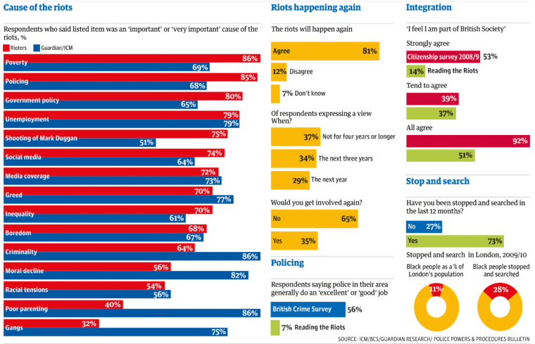
On the right is an example of data mapping created by the guardian on the london riots.
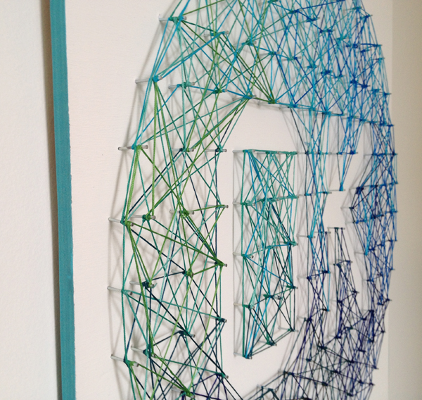
Here are just a couple of examples of how using something so simple like string and needles can create something really aesthetic and pleasing, something which although we didnt have much time we could have taken more into consideration. Along with on the left how adding even the slightest bit of detail or having a key to a data map can make it a success and actually convey its data a lot easier, again due to time restraints we werent able to do but should have been a priority